
Пример:
Для большей наглядности в пример добавлены мобильник и прокрутка niceScroll. В CSS и JS коде этого нет.
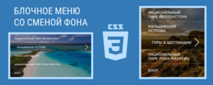
Оригинальный вид страницы с меню можно посмотреть по ссылке
Похожий пример, но с другими возможностями (пункты меню могут иметь подразделы), можно посмотреть в теме: Полноэкранное мобильное меню.

HTML:
Данный код можно разместить на странице в любом удобном месте.
|
1 2 3 4 5 6 7 8 9 10 11 12 13 14 15 16 |
<div class="mobile"> <div> <span></span> <span></span> <span></span> </div> <nav> <ul> <li><a href="#link">Главная</a></li> <li><a href="#link">Услуги</a></li> <li><a href="#link">Информация</a></li> <li><a href="#link">Доставка</a></li> <li><a href="#link">Контакты</a></li> </ul> </nav> </div> |
CSS:
|
1 2 3 4 5 6 7 8 9 10 11 12 13 14 15 16 17 18 19 20 21 22 23 24 25 26 27 28 29 30 31 32 33 34 35 36 37 38 39 40 41 42 43 44 45 46 47 48 49 50 51 52 53 54 55 56 57 58 59 60 61 62 63 64 65 66 67 68 69 70 71 72 73 74 75 76 77 78 79 80 81 82 83 84 85 86 87 88 89 90 91 92 93 94 95 96 97 98 99 100 101 102 103 104 105 106 107 108 109 |
.mobile div { display: block; position: fixed; bottom: 16px; right: 16px; background-color: #337AB7; height: 50px; width: 50px; border-radius: 50%; z-index: 9999999; border: 4px solid #BFE2FF; box-shadow: 1px 3px 5px rgba(0, 0, 0, 0.3); cursor: pointer; box-sizing: content-box; } .mobile div span { display: block; position: absolute; left: 50%; transform: translateX(-50%); width: 30px; height: 4px; background-color: #fff; border-radius: 13px; transition-duration: .4s; } .mobile div span:nth-child(1) { top: 14px; } .mobile div span:nth-child(2) { top: 23px; } .mobile div span:nth-child(3) { bottom: 14px; } .mobile div.active span:nth-child(1) { transform: translate(-15px, 9px) rotate(-45deg); } .mobile div.active span:nth-child(2) { transition-duration: 0s; opacity: 0; } .mobile div.active span:nth-child(3) { transform: translate(-15px, -9px) rotate(45deg); } .mobile nav { display: block; position: fixed; bottom: 16px; right: 16px; height: 50px; width: 50px; border-radius: 50%; z-index: 9999990; transition-duration: .4s; display: flex; align-items: center; justify-content: center; overflow: hidden; } .mobile nav.open { background-color: rgba(0, 0, 0, 0.9); width: 100vw; height: 100vh; right: 0px; bottom: 0px; border-radius: 0; } .mobile nav ul { display: none; } .mobile nav ul.show { display: flex; flex-direction: column; list-style: none; margin: 0; padding: 0; } .mobile ul li { display: flex; align-items: center; justify-content: center; background-color: transparent; width: 100%; opacity: 0; animation-name: fadein; animation-duration: 1s; animation-fill-mode: forwards; } .mobile ul li:not(:last-child) { margin-bottom: 22px; } .mobile ul li a { font-size: 24px; font-family: 'Roboto', sans-serif; text-transform: uppercase; letter-spacing: 0.1em; text-decoration: none; color: #fff; } @keyframes fadein { 0% { opacity: 0; } 100% { opacity: 1; } } |
Для того чтобы не показывать меню на широких экранах, можно добавить:
|
1 2 3 4 5 |
@media (min-width:768px){ .mobile { display: none; } } |
jQuery:
|
1 2 3 4 5 6 7 8 |
$('.mobile div').on('click', () => { $('.mobile div').toggleClass('active'); $('.mobile nav').toggleClass('open'); $('.mobile nav ul').toggleClass('show'); }); for (let a = 1; a <= $(".mobile ul li").length; a++){ $(".mobile ul li:nth-child("+ a +")").css("animation-delay", "."+ (a+1) +"s"); } |


Добрый день, подскажите пожалуйста надпись МЕНЮ сбоку, справа от кнопки бургера, саму кнопку передвинул наверх, влево, а надпись сделать не получается.... Заранее огромное спасибо!
Не совсем понял, как это выглядит, можно ссылку на сайт?
Доброе утро, непонятно объяснил, прошу прощения, вот ссылка: https://wd7287.craftum.io/
То есть кнопку переместил вверх и влево, и хотелось бы сделать надпись МЕНЮ справа возле бургера, но у самого к сожалению красиво совсем не получается.
И если не трудно, подскажите что отвечает за всплытие самого меню, оно справа-снизу появляется при нажатии на бургер, а что нужно изменить чтобы сделать появление сверху-слева?
Alexander, спасибо за обратную связь!
.mobile nav и .mobile nav.open заменить right на left и bottom на top
а с текстом там посложнее, там и хтмл и ксс править нужно, завтра с утра сделаю, выложу.
Огромное человеческое спасибо, Alexander!
Добавить CSS
.mobile div:after {
	content: "МЕНЮ";
	background-color: #337AB7;
	position: fixed;
	height: 50px;
	top: 16px;
	left: 12px;
	color: #FFF;
	border-radius: 60px;
	border: 4px solid #BFE2FF;
	display: flex;
	flex-flow: column;
	justify-content: center;
	font-weight: bold;
	z-index: -1;
	padding: 0 20px 0 60px;
	box-shadow: 1px 3px 5px rgba(0, 0, 0, 0.3);
}
В классе .mobile div можно удалить тень box-shadow
Здравствуйте, Александр! Очень нравится это меню, но! Как сделать, чтобы оно было не фиксированное, а располагалось в шапке в столбце flex???
Править класс .mobile div, чтобы был не фиксированный.
И соотв. все меню нужно расположить в шапке.
Не получается 🙁
большое спасибо за этот скрипт)))