Пример:
HTML:
|
1 2 3 4 5 6 7 8 9 10 11 12 13 14 15 16 17 18 19 20 21 22 23 24 25 26 27 28 29 30 31 32 33 34 35 36 37 38 39 40 41 42 43 44 45 46 47 48 49 50 51 52 53 54 55 56 |
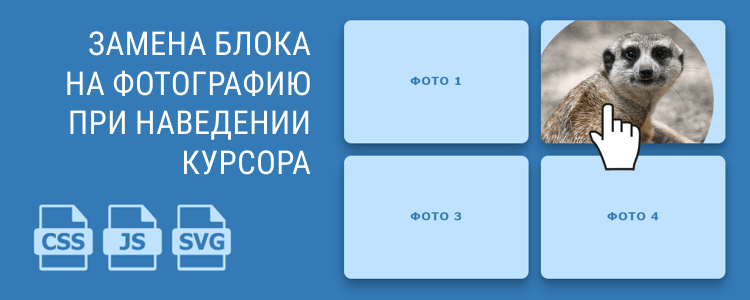
<div class="items"> <div class="item"> <a href="#item"> <svg preserveAspectRatio="xMidYMid slice" viewBox="0 0 300 200"> <defs> <clipPath id="clip-0"> <circle cx="0" cy="0" r="150px"></circle> </clipPath> </defs> <text dy=".3em" x="50%" y="50%"> Фото 1 </text> <g clip-path="url(#clip-0)"> <image preserveAspectRatio="xMinYMin slice" xlink:href="/photo.jpg"></image> </g> </svg> </a> </div> <div class="item"> <a href="#item"> <svg preserveAspectRatio="xMidYMid slice" viewBox="0 0 300 200"> <defs> <clipPath id="clip-1"> <circle cx="0" cy="0" r="150px"></circle> </clipPath> </defs> <text dy=".3em" x="50%" y="50%"> Фото 2 </text> <g clip-path="url(#clip-1)"> <image preserveAspectRatio="xMinYMin slice" xlink:href="/photo.jpg"></image> </g> </svg> </a> </div> <!-- Еще блоки --> <div class="item"> <a href="#item"> <svg preserveAspectRatio="xMidYMid slice" viewBox="0 0 300 200"> <defs> <clipPath id="clip-5"> <circle cx="0" cy="0" r="150px"></circle> </clipPath> </defs> <text dy=".3em" x="50%" y="50%"> Фото 6 </text> <g clip-path="url(#clip-5)"> <image preserveAspectRatio="xMinYMin slice" xlink:href="/photo.jpg"></image> </g> </svg> </a> </div> </div> |
Обратите внимание на ID у элемента clipPath и его использование
CSS:
|
1 2 3 4 5 6 7 8 9 10 11 12 13 14 15 16 17 18 19 20 21 22 23 24 25 26 27 28 29 30 31 32 33 34 35 36 37 38 39 40 41 42 43 44 45 46 47 48 49 50 51 52 |
.items { display: flex; flex-flow: row wrap; justify-content: center; } .items svg { position: absolute; top: 0; left: 0; width: 100%; height: 100%; } .items circle { transform-origin: 50% 50%; transform: scale(0); fill: #000; transition: transform 200ms cubic-bezier(0.25, 0.46, 0.45, 0.94); } .items text { font-size: 18px; text-transform: uppercase; text-anchor: middle; letter-spacing: 1px; font-weight: 600; fill: #FFF; font-family: Verdana, sans-serif; } .items image { transform: scale(1.1); transform-origin: 50% 50%; transition: transform 200ms cubic-bezier(0.25, 0.46, 0.45, 0.94); width: 100%; height: 100%; } .item { display: flex; align-items: center; justify-content: center; position: relative; overflow: hidden; width: 300px; height: 200px; margin: 10px; cursor: pointer; background-color: #337AB7; border-radius: 12px; box-shadow: 0 4px 12px rgba(0,0,0,0.2), 0 16px 20px rgba(0,0,0,0.2); } .item:hover circle, .item:hover image { transform: scale(1); } |
JS:
|
1 2 3 4 5 6 7 8 9 10 11 12 13 14 15 16 17 18 19 20 21 22 23 24 25 26 27 28 29 30 31 32 33 34 |
var items = [], point = document.querySelector('svg').createSVGPoint(); function getCoordinates(e, svg) { point.x = e.clientX; point.y = e.clientY; return point.matrixTransform(svg.getScreenCTM().inverse()); } function Item(config) { Object.keys(config).forEach(function (item) { this[item] = config[item]; }, this); this.el.addEventListener('mousemove', this.mouseMoveHandler.bind(this)); this.el.addEventListener('touchmove', this.touchMoveHandler.bind(this)); } Item.prototype = { update: function update(c) { this.clip.setAttribute('cx', c.x); this.clip.setAttribute('cy', c.y); }, mouseMoveHandler: function mouseMoveHandler(e) { this.update(getCoordinates(e, this.svg)); }, touchMoveHandler: function touchMoveHandler(e) { e.preventDefault(); var touch = e.targetTouches[0]; if (touch) return this.update(getCoordinates(touch, this.svg)); } }; [].slice.call(document.querySelectorAll('.item'), 0).forEach(function (item, index) { items.push(new Item({ el: item, svg: item.querySelector('svg'), clip: document.querySelector('#clip-'+index+' circle'), })); }); |
Найдено на codepen.io у пользователя Noel Delgado


Добавить комментарий: