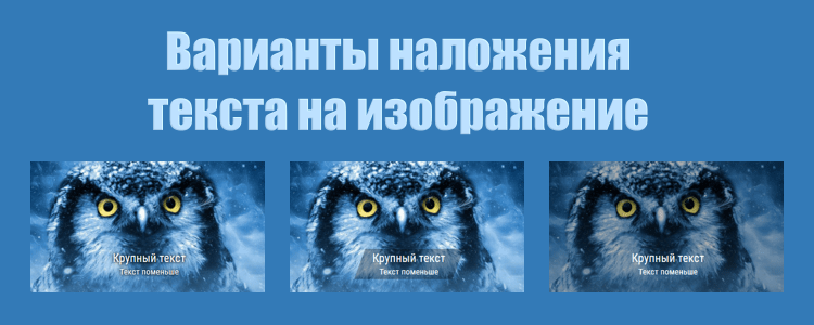
Обычный вариант наложения текста на изображение будет выглядеть так:
Крупный текст
Текст поменьше
|
1 2 3 4 5 6 |
<div class="text-wp"> <div class="text-bg"> <h1>Крупный текст</h1> <h2>Текст поменьше</h2> </div> </div> |
|
1 2 3 4 5 6 7 8 9 10 11 12 13 14 |
.text-wp { background:url(image.jpg); background-size:cover; background-position:center; height:400px; position:relative; } .text-bg { text-align:center; position:absolute; width:100%; bottom:10%; color: #FFF; } |
1. Затемнить или засветлить все изображение
Для этого нужно добавить всего один слой для изображения
Крупный текст
Текст поменьше
|
1 2 3 4 5 6 7 |
<div class="text-wp"> <div class="text-lay"></div> <div class="text-bg"> <h5>Крупный текст</h5> <h6>Текст поменьше</h6> </div> </div> |
|
1 2 3 4 5 6 7 8 9 10 11 12 13 14 15 16 17 18 19 20 |
.text-wp { background:url(image.jpg); background-size:cover; background-position:center; height:400px; position:relative; } .text-bg { text-align:center; position:absolute; width:100%; bottom:10%; color: #FFF; } .text-lay { position:absolute; width:100%; height:100%; background:rgba(0,0,0,0.3); } |
Для засветления стиль: background:rgba(255,255,255,0.3); и соотв. темный текст.
2. Затемнить или засветлить фон за текстом
Вариант очень похож на первый, только фон накладывается не на изображение, а на текст. А также немного повернем его, чтобы не было сильно квадратно.
Крупный текст
Текст поменьше
|
1 2 3 4 5 6 7 8 |
<div class="text-wp"> <div class="text-bg"> <div class="text-bg-2"> <h1>Крупный текст</h1> <h2>Текст поменьше</h2> </div> </div> </div> |
|
1 2 3 4 5 6 7 8 9 10 11 12 13 14 15 16 17 18 19 20 |
.text-wp { background:url(photo.jpg); background-size:cover; background-position:center; height:400px; position:relative; } .text-bg { text-align:center; position:absolute; bottom:10%; width: 300px; left:calc(50% - 150px); background:rgba(0,0,0,0.3); transform: skew(-20deg); } .text-bg-2 { transform: skew(20deg); color: #FFF; } |
3. Добавить к тексту тень
Самый простой вариант с добавлением всего 1 стиля
Крупный текст
Текст поменьше
|
1 2 3 4 5 6 |
<div class="text-wp"> <div class="text-bg"> <h1>Крупный текст</h1> <h2>Текст поменьше</h2> </div> </div> |
|
1 2 3 4 5 6 7 8 9 10 11 12 13 14 15 |
.text-wp { background:url(image.jpg); background-size:cover; background-position:center; height:400px; position:relative; } .text-bg { text-align:center; position:absolute; width:100%; bottom:10%; color: #FFF; text-shadow: 0 0 12px rgba(0,0,0,0.5), 0 2px 6px rgba(0,0,0,0.7); } |
Или тень-обводку в 1-2 пикселя. На темный текст светлую, на светлый - темную.
Крупный текст
Текст поменьше
|
1 2 3 4 5 6 |
<div class="text-wp"> <div class="text-bg"> <h1>Крупный текст</h1> <h2>Текст поменьше</h2> </div> </div> |
|
1 2 3 4 5 6 7 8 9 10 11 12 13 14 15 |
.text-wp { background:url(image.jpg); background-size:cover; background-position:center; height:400px; position:relative; } .text-bg { text-align:center; position:absolute; width:100%; bottom:10%; color: #FFF; text-shadow: -2px 0 0 #337AB7, 0 -2px 0 #337AB7, 2px 0 0 #337AB7, 0 2px 0 #337AB7, -2px -2px 0 #337AB7, 2px 2px 0 #337AB7, -2px 2px 0 #337AB7, 2px -2px 0 #337AB7; } |
4. Наложить под текст фон с фильтром
Подробнее об этом примере смотрите в заметке "Текст на размытом фоне"


Добавить комментарий: